
Simple tricks to find the right paint colours for your home
2 Minute Read
Summary
- Apply the 60‑30‑10 rule to balance dominant, secondary, and accent paint colours effectively.
- Choose paint colours by pulling coordinated hues from a room’s largest existing feature.
- Test paint samples on walls in natural and artificial light before final selection.
Choosing the right paint colours can instantly transform your home, setting the mood and creating a cohesive design. But with so many swatches to pick from, where do you start?
Trending colours can be a great source of inspiration, and in 2025, they have shifted to an earthier palette. For example, Dulux's Paint colour of the year is "Purple Basil," a blend of plum and earthy undertones that adds depth to any space.
Whether you choose a trending hue or your favourite colour, here's what to consider when picking paint colours for your home.
The sixty-thirty-ten rule
The sixty-thirty-ten rule is a timeless design strategy for achieving harmony in your space. This simple yet effective principle ensures a balanced distribution of tones, creating a polished and cohesive look.
Begin with your primary base shade, which should cover about 60 per cent of the room. Usually, it would cover walls, large rugs, or floor coverings—elements that set the foundation for the space. Next, allocate 30 per cent of your scheme to a secondary tone that complements the base. You'll often find this in furniture upholstery, curtains, or other significant features.
Dedicate the remaining 10 per cent to accent tones, the statement pieces that catch the eye. Think decorative pillows, artwork, or small accessories.
Start with a key piece
If you are unsure where to begin, look to your space's largest or most visually striking item. Maybe it's an area rug, sofa, or statement piece of artwork.
Pull hues from these pieces and distribute them throughout the room to maintain a sense of flow and intention. This approach ensures each element complements the others, simplifying decisions as you layer in accents.
Explore the colour wheel
The colour wheel and its principles are invaluable for refining your design choices. Analogous shades—those sitting side by side on the wheel—create a soothing, harmonious effect, while complementary tones, positioned opposite each other, deliver bold, high-contrast energy.
Consider pastel tones, such as soft blues paired with neutral creams or greys, for a tranquil atmosphere. Opt for striking contrasts such as forest green and deep terracotta if you seek depth and drama.
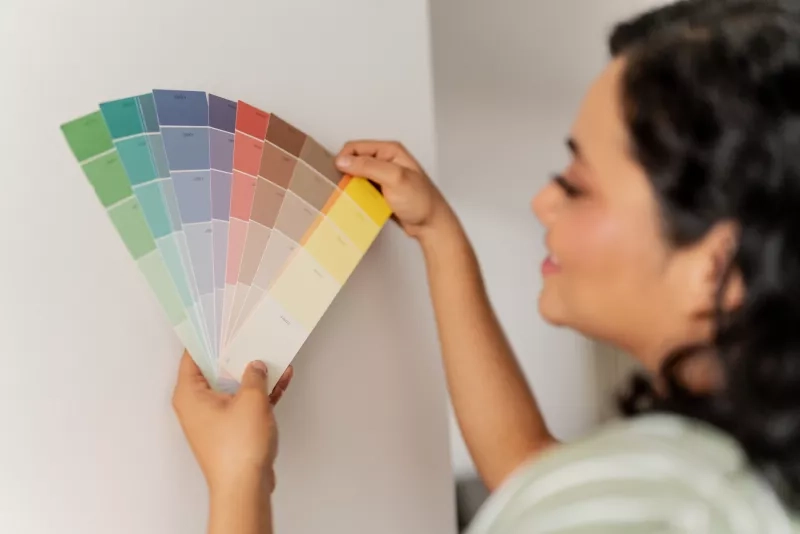
Don't forget about lighting
Natural and artificial light completely change how colours look. Always test your paint swatches on your walls first, observing how they work at different times of day. A shade that looks beige in-store could appear pink or yellow in afternoon sunlight.
Ready to start painting?
CAA Members save 25% on regular-priced Dulux manufactured paints and stains, 10% off the regular price of most tools and applicators and earn 3% back in CAA Dollars.